FANTASTICO!!!!! CREATIVITY AT LAST......
So sorry for the flash in the window but could not get away from it.
This is GREAT.....as you can see it's a classic Levis denim jacket fashioned from nails...This is so cool...and yes I'll say it again CREATIVE!!!
Way to go Levis Store!!!
Wednesday, August 4, 2010
Tuesday, August 3, 2010
H & M Fifth Avenue
Clever, creative, deliberate, fun, fashion, that's what this store gives you in their windows AND, if that don't make you want to go into this store and shop nothing will. BRAVO H & M.....GREAT WINDOWS....GREAT PRESENTATION....GREAT VISUAL STAFF THAT KNOWS HOW TO MAKE A LASTING VISUAL PRESENTATION..........
Tuesday, July 27, 2010
Bloomingdale's Lexington Avenue
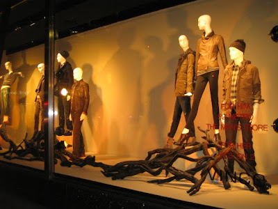
Killer styling on the mannequins in these Vince windows......otherwise.....does anybody have a match to light this pile of firewood to ignite this bonfire of the bad windows???
UGHHHHHHH.......how pedestrian...how boring...how uninteresting...but wait, maybe they intentionally created ugly windows so we would pay attention to the clothes....ok...I'll...ugh... give that to them. Although I can't imagine anyone wanting to take credit for the planning or execution of these windows...a first time trimmer could create these in their sleep....it's 90 degrees here in NYC and we get it that the clothes are for Fall....but the tired and tacky mix of semi-gloss and flat painted driftwood creates what message??? Come on Bloomingdale's you are much better than this!!!
UGHHHHHHH.......how pedestrian...how boring...how uninteresting...but wait, maybe they intentionally created ugly windows so we would pay attention to the clothes....ok...I'll...ugh... give that to them. Although I can't imagine anyone wanting to take credit for the planning or execution of these windows...a first time trimmer could create these in their sleep....it's 90 degrees here in NYC and we get it that the clothes are for Fall....but the tired and tacky mix of semi-gloss and flat painted driftwood creates what message??? Come on Bloomingdale's you are much better than this!!!
Ann Taylor Madison Avenue
In my opinion, when you have hundreds of stores across the country you have a responsibility to your customers and everyone who sees your stores. I came upon these windows last night and wanted to barf immediately. Not only is their message lame, and the window presentation flat, uninteresting and just plain out unimaginative. And yes, take a close look, those are necklaces they have draped on the Magnolia that are in the vases....This is a no-way, no-how, never, never thing to do on any level of visual presentation. And to top it off the copy on the windows....LEOPARD...A BOLD and BEAUTIFUL nod to our heritage....
Can anyone tell me just what in the world that statement means????
Friday, July 23, 2010
Bloomingdales 60th. Street & Lexington
Gowns, Glamour and chipped Mirrored Balls......how simple....effective.....yet so predictable.....but, I must say I really expected more from Bloomingdale's. Don't get me wrong I don't just bash Bloomingdale's but....this store should be better than this (what happened to the days of Candy Pratt}?.....Bloomingdale's is world renowned. Kings, Queens (Royal ones and non-Royal), Presidents and dignitaries from around the globe have visited this very store.....This is a New York institution like the Plaza Hotel....er...well,.. now that's not a good example.. look what happened to that place....can you say Viva Las Vegas???
I'm waiting for Bloomingdale's to step up to the plate and get their best Creativity game on!!!
I'm waiting for Bloomingdale's to step up to the plate and get their best Creativity game on!!!
Thursday, July 22, 2010
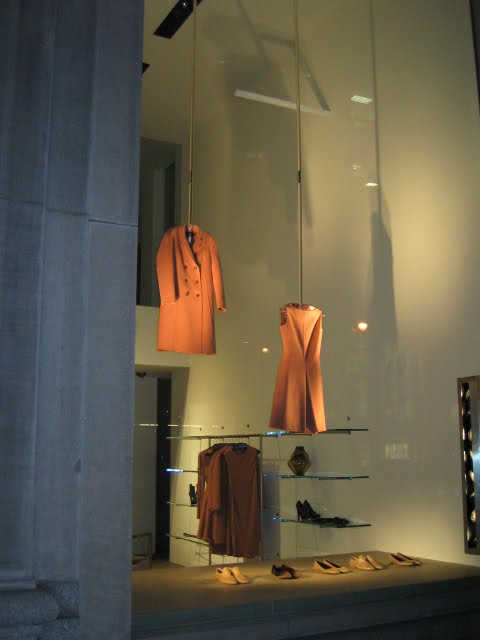
Calvin Klein Madison Avenue
Cool, sleek and modern minimalism at it's best!! This is a Great Window. Clean simple design from the acrylic rods and hangars the clothes are hanging from to the lighting that casts a dramatic shadow onto the wall and the perfect shoes. This window is an A+ in my book. What great use of negative space. A Designer/Company who knows who their customer is and presents it beautifully every time.....Thank you Francisco Costa for "keeping it simple and sexy"....Bonito!!
Barney's Madison Avenue
Barney's does the best men's fashion windows in this City in my book.....they create a clear fashion statement without the bells and whistles that can gunk up great merchandise in an over propped window....yes, there is a lot of merchandise in the windows but, you can see everything and it all makes sense from head to toe. The forms are animated just enough to create a sophisticated and well dressed mans' attitude. Very nice!!
Subscribe to:
Posts (Atom)


